Sunday, August 26, 2018

Current reading

William McCance: Woman reading (image from here)
I have two main books on the go at present: Red Thread, On Mazes & Labyrinths by Charlotte Higgins, and A line made by walking by Sara Baume.  It was not at all planned that I would read these together, but they complement each other remarkably.  I have only just started the former, but am finding it a book that I want to read consistently rather than just dipping for information.  The red thread is pulling me, as I enjoy the content which is of a personal as well as informational telling.  (A review can be found here.)
The red thread for the protagonist Frankie in A line made by walking is her knowledge and recall of works of art, which pulls her through the labyrinth of her breakdown.  (Of course the title of the novel is also the title of a seminal work of art by Richard Long.) Frankie concentrates on small, tiny, almost microscopic details of observation and of thought, and of feeling, which somehow does not depress me as reader.  Rather I find myself participating in the observations while still standing outside it all.  A fascinating read.  (A review can be found here.)

Friday, August 24, 2018

Exhibiting the collection

The Crafts Study Centre has a wondrous collection which it shows under different themes.  The current exhibition is related to books: Brought to Book.  I always love seeing these displays of the collection because the quality is so rewarding to observe - inspiring.
Most closely related to books of course is calligraphy, and the display which caught my interest most was that of Thomas Ingmire.  The perennial problem with display of artists' books of course is that behind glass only one double page spread is displayed.  In this case fortunately the work on show consists of a box of nine booklets, so multiple double page spreads are available.   This was the first time I had encountered this artist, and look forward to exploring more. Unfortunately I have not been able to track down illustrations for the work on display: Calligraphy ... some thoughts, but there are many examples of his work on his website, and better photographs on the Vamp & Tramp website.
Lucie Rie: vase (image from here)
A long favourite in the ceramics department is Edmund de Waal.  Today's visit reminded me that I have not yet read his book The White Road.  Perhaps I was put off by the final paragraph of Kathleen Jamie's review in the Guardian newspaper as although I understand the first, I count myself in her second kind of people:
There are two kinds of people in the world. One lot are hoarders, those frightened to let anything go, who imbue objects with memories, who feel aghast, naked, stripped of their identity without their accumulations, collections, crowded cabinets and vitrines. They will love this book. The other kind, those who value silence and space, may feel they are asphyxiating, that time and a thorough edit would have revealed the book’s true shape, its “beautiful resonance”. There’s no doubting that The White Road is a mighty achievement, but De Waal is himself relieved when it’s over, and he is back at his wheel in his studio, throwing white pots, “making again”.
By his book in the vitrine was a selection of white pots from the collection, including the exquisite Lucie Rie vase above.
Several lengths of Barron and Larcher design printed cloth from the Christopher Farr company revival hang beautifully next to a film of poet Jane Weir reading from her book of poems Walking the Block.  There is a very short YouTube film (not the same one) of Weir here.  Walking the Block, is a poetic biography based on the lives of the Modernist handblock printers and textile artists, Phyllis Barron and Dorothy Larcher, who created a unique range of hand block printed naturally dyed textiles between the two World wars.  (from here)
(image above from here)
The book has many full page illustrations of the textile designs.
(image from here)
I was delighted to find puppets in the exhibition - I had not expected them, and had not heard of their maker William Simmonds.  He and his wife Eve together created them, as described here.  I am grateful that a book about him is about to be published, and so the lovely pieces were put on display.  There is a blog post about Simmonds here, with pictures of other puppets.

All in all an enriching exhibition of timeless quality work.


Thursday, August 23, 2018

Elaborate, joyous, outrageous, ...

are all adjectives applied to the ceramics of Angus Suttie.  There is an exhibition of his work on at present at the Crafts Study Centre in Farnham.  The exhibition originated at the Ruthin Crafts Centre which also produced a beautiful slim catalogue.
(image from here)
I am not a fan of the over-elaborate, of anything which I put into the category of encrusted, and so I was not eager, but simply curious to see the exhibition based on the quality normally found at the Crafts Study Centre.  I was so pleased that I made the effort, because although still not my favourite ceramics, there is something vitally compelling about the power in these pieces.  They are very obviously personal expressions of strong emotion.  At the very least teapots with attitude!
By taking a traditionally functional object and riffing on that theme, anthropomorphising it, stretching credibility, a cheeky joy is evoked, and even more, I found them thought-provoking.
Angus Suttie: Doodle plate (image from here)
Although I could feel the power of the brighter, elaborately coloured works, like the Doodle plate above, my preferred pieces were the 'duller' more sculptural ones made later in his short career, when AIDS had made an impact on his friends' and his lives.
Angus Suttie: Large Blue Form (image from here)
This piece above in the V&A collection appeals to me more - but I surprised myself by how drawn I was to the work as a whole.  This is not only the result of such a powerful expression of personality, but also the excellence of presentation.  A solo exhibition is a wondrous vehicle for examining an artist's work on their own terms.
(image from here)
I could not find images online of the pieces I responded to most in the exhibition - probably because the pieces in the show are mostly from Suttie's own collection.  But I found several examples which I think show his style.
(image from here)
(image from here)
Suttie also made ceramic rings - decorative knuckle dusters.  In the exhibition there is a photograph of dancer/choreographer Michael Clark wearing one.
(image from here)
The above and some more images can be found here.

Wednesday, August 22, 2018

The saying goes:

A picture is worth a thousand words.  True, unless shouted out, words do not grab the attention like a picture.  But I've been thinking a lot about the increasing use of pictures to grab attention.
A season ago I was one of three judges for a quilt exhibition, and during this exercise we based our choices on digital photographs.  I have a large good quality monitor and thus can see close-up pix in detail; but had not been asked whether I perhaps work only from a laptop.  So much of a textile piece of work is alive in its presence - and which can be diminished when reproduced as a photo, no matter how well taken.  On the other hand, how else would we have international exhibitions without amazing expense.
But have we become immune to the attractions of work which needs close looking, long looking, to be appreciated?  Do we increasingly crave instant but fleeting gratification?
I see so many folks going over to Instagram and leaving blogs, and get the feeling that it's soon going to be all show and no tell.  A flick-book can be great fun, but I must admit that I do appreciate the input of substantial content.
At the exhibition inspired by Virginia Woolf's writings at the Pallant House Gallery I came across a quote that got me thinking about all of this.  I found that the exhibition just has so many pieces of work which need attention, time, contemplation, further thinking, that I began to suffer from mental indigestion.*  I sat down to take time watching a video and read the label which included the following quote:

We launch out now over the precipice.... The cliffs vanish.  Rippling small, rippling grey, innumerable waves spread beneath us.  I touch nothing.  I see nothing.  We may sink and settle on the waves.  The sea will drum in my ears.  The white petals will be darkened with sea water.  They will float for a moment and then sink.  Rolling me over the waves will shoulder me under.  Everything falls in a tremendous shower, dissolving me.
From The Waves 1931 by Virginia Woolf.

I read that and closed my eyes, and there I was: over, in, under the sea.  Of course as someone who makes pictures I far from want to eliminate them.  But do we want to evolve into folks who communicate not only by instant images, but also caption them with emoticons!  I do hope not.


*I bought the catalogue and have been able to spend more time thinking about individual works.  The ideal would have been to go back day after day, concentrating on a handful of works at a time. But, in the absence of that solution exhibition catalogues are wondrous gems - or they can be.  Unfortunately I just HATE the design of this one.  The design definitely gets in the way of the content, when the whole purpose should be to clarify the content. 

Monday, August 20, 2018

In the heat

I've never been good in heat - and yet I could never be doing with an idle siesta time.  In my youth I used to read at the very least.  I'm not one for falling asleep during the day.
Hot novel
Recently we have had too much prolonged heat when I have not been able to stitch - so instead I decided to re-do my website.  It is at the same address, but I have used clikpic to provide a template.
I have put more of my work on, in more categories, and will be able to manipulate the design and content much more easily now.

Sunday, August 19, 2018

Simply exquisite

I have not been to the Crafts Study Centre in a while and was just checking up on what is on there at present.  They hold designs, blocks, and printed samples by Phyllis Barron and Dorothy Larcher, and my wanderings today found that Christopher Farr Cloth is reviving some of their designs.
Already a fan of his rugs, I now admire his choice of fabric designs.
All the images in this post are from the Christopher Farr Cloth website.

Thursday, August 16, 2018

Chilling delights

Barbara Rae: Light at Jacobshavn (image from here)
In today's post came a catalogue I've eagerly been awaiting: Barbara Rae, The Northwest Passage from the exhibition at the Royal Scottish Academy.  I have flicked through it, and it does not disappoint at all.  I shall devote this afternoon to reading what looks like a most interesting text about the artist's journeys to northern Canada, and about the explorer himself.  John Rae was not an ancestor of Barbara Rae, but did inspire her.
Barbara Rae: Distant White Berg (image from here)
Here is a review with photos of the exhibition

Sunday, August 12, 2018

Summer winding down?

Plantlife
I am relieved that the great heat has diminished - so much that I have closed the greenhouse door after over a month of it being permanently open.  The fruit, tomatoes and aubergines, are ripening.  The batch cooking will soon be in full swing.
I am able to stitch again, and have resumed my great clear-out.  The sewing and quilting hoops which I have had for decades but never used have all gone to the hospice charity shop, as has much other stuff.  More yet to be redistributed hither thither and yon - with much relief, and increasing eagerness.
Different days
This year I was asked to be one of the judges for SAQA's Wide Horizons VI exhibition which will take place in September and then tour.  As a judge one of my pieces will be in the show.  I have also been invited to include three pieces in Wisconsin's Museum of Quilts and Fiber Arts exhibition Fiber Arts in the Digital Age.
This has been the year of the big think about what I'm doing, and I now am ready to face the upcoming Autumn with new vigour.  I have written a post about it in my work blog.  During the hottest days of the past weeks I stayed cool in the shade designing a new website which I hope will be active soon. 
I don't know what kind of work I shall be making next - my energies will be mostly devoted to organisation for a wee while - but as ever ideas will doubtless push their way through before long.
Hello, Goodbye

Saturday, August 11, 2018

A good read

I am thoroughly enjoying reading Modernists and Mavericks: Bacon, Freud, Hockney and the London Painters by Martin Gayford.  It is well written, straightforwardly, using the words of the painters themselves - an enthralling tale, developing from the immediately post war years.  Although I thought I knew quite a lot about Bacon, for instance, I have learned so much more, and I can put him in a fuller context now.  I am so enjoying thinking about the development of artists, what they believe is important despite critics, galleries, and collectors/market.  It is fascinating reading about what motivates the search for artistic achievement - and what in society at large can make the changes within or between artists over time. 

Friday, August 03, 2018

A long hot summer

I particularly enjoy a copper beech in the summer because it stands out magnificently from the ubiquity of green.  It also seems to look cooler in days of burning sun.
(image from here)
The last time I remember us having such a long hot summer was in the extraordinary year of 1976.  I was fortunate to be working at Oxford University Press in Oxford, in a building that has enormously thick walls, and so arriving early and leaving late I avoided much of the heat.
(image above from Bing maps showing the replacement tree today-ish)
Also, in the quadrangle there was a giant copper beech, taller than the building, which created a delightful shade under which to eat lunch if there was a wee breeze.  Unfortunately I learned some years ago that the tree died; but has been replaced by a youngster, who has a hundred years or so to go to catch up with its predecessor.
Another memory from that summer is receiving a phone call from an artist who was always coming up with excuses for late delivery - this time it was that the extreme heat had caused his mother-in-law's garden shed to explode!

Tuesday, July 24, 2018

Wishful thinking!

A big splash - inspired by Picasso, Hockney, and a love of bathing in the sea.

Wednesday, July 18, 2018

An art exhibition inspired by the writings of Virginia Woolf

Wilhelmina Barnes-Graham: Rocks, St Mary's, Scilly Isles (image from here)
This travelling show is at the Pallant House Gallery in Chichester at present.  I had been curious to see what the show would include, and why, and was impressed with the ground that is covered - both of the writing, and of the art gathered for the exhibition.
The paintings, sculpture, fabric designs, photographs, videos etc. do not only come from contemporaries of Woolf, but also from all the way up to contemporary artists.  The categories covered are Landscape and Place, Still Life, Home and 'A room of one's own', The Self in Public, and The Self in Private.  It was all most thought-provoking.
Wilhelmina Barnes-Graham: Blue Stone El Golfo (image from here)
The works which struck me most in the first section: Landscape and Place were paintings by Wilhelmina Barnes-Graham, of whose work I am already a great fan.  These three sang across the years with to me as much impact - if not more - as anything contemporary.
Wilhelmina Barnes-Graham: Cliff (image from here)
In the Still Life, the home and 'a room of one's own' galleries I was delighted to find fabric designed by Enid Marx, Vanessa Bell, and Marion Dorn
Vanessa Bell: Pamela fabric design (image from here)
Vanessa Bell: Maude fabric design (image from here)
Enid Marx: Fishnet fabric design (image from here)
Barbara Kasten: Untitled 13 (image from here)
I was intrigued by photographs by Barbara Kasten.  She made models - sculptures in fact - and photographed them.  I have seen several sculptures made of perspex in the 20th century but which now are frankly quite 'manky' looking.  It was great therefore to see one as the artist who had just made it wanted it to look - even if that is not in three dimensions.
Barbara Kasten: Untitled 11 (image from here)
Of course Kasten made these in the 1970s, so I persuade myself (remembering that decade well) that perhaps the models might still look reasonable.

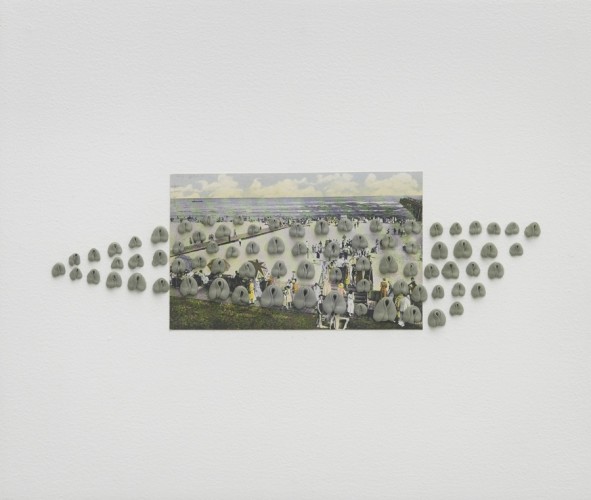
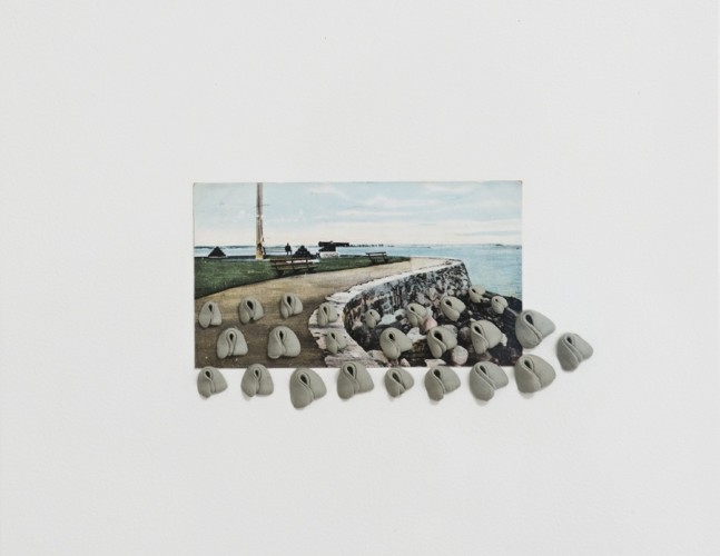
The Self in Private included much feminist art which did not attract me, and with an exhibition encompassing so much diverse work I tend to focus on what attracts, delights, or intrigues me.  Certainly the two works by Hannah Wilke in this gallery seduced me.  Each is a vintage postcard with added kneaded eraser sculptures.
Image result for hannah wilke atlanta city boardwalk
Hannah Wilke: Atlantic City Boardwalk (image from here)
Image result for hannah wilke sea wall
Hannah Wilke: Sea Wall (image from here)
I just love the way they look - but I have no idea why I am so smitten.  Having looked at her website, there are only one or two other similar assemblages which I'm drawn to in her work.


Lili Dujourie: Passion de l'ete pour l'hiver still from video (image from here)
In a gallery between The Self in Private and The Self in Public there were video screens.  One drew me close, and made me think. Lili Dujourie's video did not have headphones, and I was quietly mesmerised by the simple presentation of a woman at a window, moving gradually round, with a dog lying nearby.
Earth, Standing Stone, Wiltshire, Avebury, England
Michelle Stuart: Earth, Standing Stone, Wiltshire, Avebury, England (image from here)
Ridgeway near Overton Hill, Avebury, England
Michelle Stuart: Ridgeway near Overton Hill, Avebury, England (image from here
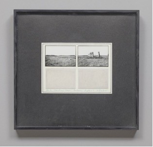
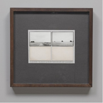
In the same room there are several neat intriguing works by Michelle Stuart which I thought should have been with the Landscape works.  The pieces on view are beautiful encapsulations of labelled samplings, evidence from magical prehistoric areas of England.  The earth from the area is presented below photographs, rather like sheets from a Victorian collection.  I'm not sure if the illustrations above are ones in the exhibition, but these are similar.  They very much reminded me of the work that Debbie Lyddon has being doing with pigments from the Norfolk coast.

Gwen John: Self portrait (image from here)
The Self in Public included many portraits, and my head already being full of too much thinking I was drawn only to an old favourite: Gwen John's Self portrait.  This makes a great top and tail to the exhibition, as I love Laura Knight's woman by the sea which is the first room of the show.  Both images are taken from this blog post of the exhibitionHere is a review of the exhibition when it was at the first venue of Tate St. Ives.
Dame Laura Knight: The dark pool (image from here)

Friday, July 06, 2018

Excitements

I have recently received my first copy of Pressing Matters - their fourth issue - having found out about the magazine through Annie Bissett's blog.
Also my 'handbag' press has arrived, and after Wimbledon I'm hoping for cooler weather so that I can explore using it.  Too sticky for stitching, my activities are reduced to tennis watching, reading, and most intermittent animation required for gathering fruit to make into frozen yoghurt.  

Thursday, June 28, 2018

Park pavilion

Our trip up to Hyde Park provided quite a selection of treats.  Not only the two exhibitions at the Serpentine galleries, the Mastaba on the lake, and also the annual Summer Pavilion.  This year's architect is Frida Escobedo, and the reviews here and here built up our expectations.
Arriving before it was open to the public I took a few snaps while it was empty. 
After we had seen the Mastaba and the Tomma Abts we returned to have a coffee before visiting the Christo and Jean-Claude exhibition.  We were disappointed to find that the space is so limited that only four tables with four chairs each were provided for sitting to drink our expensive coffee and enjoy the ambience.  The reflecting roof is fun, but also makes the space feel even smaller, and the pool of water rather resembled a puddle - or a designer dog water bowl (that's a bit harsh on my part - the dogs appreciated it!).  
As a pavilion for a private garden it would make a lovely cool space on really hot days like this week, but we did not think that it works as a public space.  Brilliant use of concrete roof tiles, however!