James Turrell: Mors - Somnus (07) Medium Diamond Glass (image from here)
One work in the RA Summer Exhibition that was worth the visit alone for me was James Turrell's light piece in a quiet cool dim room. The diamond square of light changes colour ever so gradually, and not an even flat colour. Subtle tones are spread across the whole square, radiating from its centre. The square is set in a white wall, not black as shown above. Except that it does not look white: as the colour changes in the square its subtleties are signalled first in what you apparently see of the opposing colours in the surrounding wall. Those of you who typed on the original word processors will remember that the bilious green text would conjure up red letters when looking away or shutting eyes.
This piece of Turrell's - as so many of his - is extraordinary colour work. This is where Mondrian was leading.
This work was compulsive viewing, entrancing, thought-provoking, and so joyous. This is an artist who makes me look at the world again and again, and think about what I am seeing.
Showing posts with label Caught my mind. Show all posts
Thursday, July 04, 2019
Tuesday, July 02, 2019
Caught my eye
Banksy: KEEP OU (image from here)
After so many decades of looking at images, pictures, paintings, what is it that catches my eye? Often it is familiarity - or perhaps lack of familiarity. Certainly one aspect which holds my eye is composition. It does not have to be drama, but there needs to be a reward of some kind. The image must make me think - and think beyond the question of how it was made. For me content is queen and must definitely rule over technique. This is easier for me with painting because I don't paint. Content is still supreme although more difficult with prints as I am familiar with the techniques, and that can intrigue even if the image is not satisfactory to me. This is all personal preference needless to say.
Glen Onwin: Shades of Darkness - Light and Colour (Goethe's Theories) Blue, Red, Yellow. Earths Major Cycles (image and title from here)
Individual works are easily overlooked at the RA Summer Exhibition, and one reason why Gallery IV was my favourite is that the hang was relatively sparse. Works had room to breathe and be themselves. Glen Onwin's framed pigments (above) were arresting, being the physical embodiment of colour; pigment which was gradually accumulating at the base of each frame.
David Remfry: Chandelirium (image from here)
I very much enjoy being surprised to find that a work which attracts my eye is by an artist who is familiar, but in this case unfamiliar. This was my delight in seeing David Remfry's painting above.
Stephen Chambers: Portrait of Agatha Roman (image from here)
Portraits can be so interesting, whether the subject is known or not. Stephen Chambers' Portrait of Agatha Roman is perhaps from his Court of Redonda series, and she intrigued me additionally because her hands seemed to have a separate life of their own.
Sonia Lawson: Homage to Courbet (image from here)
Another portrait which intrigued me was Sonia Lawson's Homage to Courbet, which is so different from Courbet's own self portrait - as well as being different from the cabinet-of-curiosities style of Lawson's with which I have been familiar of recent years.
Tony Bevan: Self Portrait (image from here)
A self portrait which really caught my eye near the end of the exhibition struck a philosophical note - 'I think, therefore I am'. Tony Bevan has produced several self portraits, and this is not quite a brain, but it caught my imagination.
I liked many other paintings, but these above held my attention for more than the passing pleasurable moment.
After so many decades of looking at images, pictures, paintings, what is it that catches my eye? Often it is familiarity - or perhaps lack of familiarity. Certainly one aspect which holds my eye is composition. It does not have to be drama, but there needs to be a reward of some kind. The image must make me think - and think beyond the question of how it was made. For me content is queen and must definitely rule over technique. This is easier for me with painting because I don't paint. Content is still supreme although more difficult with prints as I am familiar with the techniques, and that can intrigue even if the image is not satisfactory to me. This is all personal preference needless to say.
Glen Onwin: Shades of Darkness - Light and Colour (Goethe's Theories) Blue, Red, Yellow. Earths Major Cycles (image and title from here)
Individual works are easily overlooked at the RA Summer Exhibition, and one reason why Gallery IV was my favourite is that the hang was relatively sparse. Works had room to breathe and be themselves. Glen Onwin's framed pigments (above) were arresting, being the physical embodiment of colour; pigment which was gradually accumulating at the base of each frame.
David Remfry: Chandelirium (image from here)
I very much enjoy being surprised to find that a work which attracts my eye is by an artist who is familiar, but in this case unfamiliar. This was my delight in seeing David Remfry's painting above.
Stephen Chambers: Portrait of Agatha Roman (image from here)
Portraits can be so interesting, whether the subject is known or not. Stephen Chambers' Portrait of Agatha Roman is perhaps from his Court of Redonda series, and she intrigued me additionally because her hands seemed to have a separate life of their own.
Sonia Lawson: Homage to Courbet (image from here)
Another portrait which intrigued me was Sonia Lawson's Homage to Courbet, which is so different from Courbet's own self portrait - as well as being different from the cabinet-of-curiosities style of Lawson's with which I have been familiar of recent years.
Tony Bevan: Self Portrait (image from here)
A self portrait which really caught my eye near the end of the exhibition struck a philosophical note - 'I think, therefore I am'. Tony Bevan has produced several self portraits, and this is not quite a brain, but it caught my imagination.
I liked many other paintings, but these above held my attention for more than the passing pleasurable moment.
Monday, May 13, 2019
One thing leads to another
Christine McArthur: The Crimson Window (image from here)
I always like to follow up exhibitions with a poke about on the Internet for more information, more illustrations of the artist's work, and anything else of interest which might arise. Pursuing the Still Life aspect of Elizabeth Blackadder's work I found the current exhibition on at The Scottish Gallery. I was attracted to a very red piece, (see above) by an artist I had not previously encountered.
Christine McArthur: Seven Pears (image from here)
Curiosity thus led me to Christine McArthur, and was lucky to find that she had recently had a solo exhibition at the same gallery: The Diary Series. There is an online catalogue for this show on the same link as the title of the exhibition, and there is also a 45 minute You Tube film of the artist talking about her work here.
Christine McArthur: Sorted Threads (image from here)
I was delighted also to discover that Christine McArthur makes embroideries, inspired by her grandfather, as explained in her talk and in the catalogue.
What I found inspiring was the discovery that the paintings are actually collages in construction. It has provided me with a spark of excitement and I have started a new notebook of ideas. Of course my work will in no way be anything like the lovely works of Christine McArthur, but she has provided me with a glimpse of an inkling as to how I want to develop.
(image from The Diary Series catalogue)
Here is a quick look at a Christine McArthur sketchbook. The integral use of words and writing also made a connection with me. Inevitably, I now have a catalogue of The Diary Series exhibition.
I always like to follow up exhibitions with a poke about on the Internet for more information, more illustrations of the artist's work, and anything else of interest which might arise. Pursuing the Still Life aspect of Elizabeth Blackadder's work I found the current exhibition on at The Scottish Gallery. I was attracted to a very red piece, (see above) by an artist I had not previously encountered.
Christine McArthur: Seven Pears (image from here)
Curiosity thus led me to Christine McArthur, and was lucky to find that she had recently had a solo exhibition at the same gallery: The Diary Series. There is an online catalogue for this show on the same link as the title of the exhibition, and there is also a 45 minute You Tube film of the artist talking about her work here.
Christine McArthur: Sorted Threads (image from here)
I was delighted also to discover that Christine McArthur makes embroideries, inspired by her grandfather, as explained in her talk and in the catalogue.
What I found inspiring was the discovery that the paintings are actually collages in construction. It has provided me with a spark of excitement and I have started a new notebook of ideas. Of course my work will in no way be anything like the lovely works of Christine McArthur, but she has provided me with a glimpse of an inkling as to how I want to develop.
(image from The Diary Series catalogue)
Here is a quick look at a Christine McArthur sketchbook. The integral use of words and writing also made a connection with me. Inevitably, I now have a catalogue of The Diary Series exhibition.
Sunday, March 31, 2019
This time of year
takes my mind to the delicacies of Nature, and coincidentally I have been reading a catalogue which does that, and more. David Hockney, Vincent Van Gogh: The Joy of Nature is an exhibition on at the Van Gogh Museum in Amsterdam until 26 May. The catalogue is available in this country, published by Thames and Hudson. I am not illustrating it here because I think that the cover design is execrable - but I'm probably out of date with typographic fashion.
The content is fantastic, however, putting views from both artists side by side. I have spent a most enjoyable time looking and looking.
A long and interesting review of the exhibition in Studio International is here - but I think that the reviewer had not read the catalogue, not quite getting Hockney's fascination with perspective/points of view.
Linked with what I was saying about this time of year, I found the drawings a delight. There are fascinating examples from both artists. I had forgotten about, and was pleased especially to be reminded of Van Gogh's elegant and eloquent pencil lines. The Van Gogh Museum website has an excellent search facility through which I have spent a deal of pleasant time wandering. Then I look through the windows to the growth outside, and am filled with delight - and perhaps even a glimpse of inspiration.
The content is fantastic, however, putting views from both artists side by side. I have spent a most enjoyable time looking and looking.
A long and interesting review of the exhibition in Studio International is here - but I think that the reviewer had not read the catalogue, not quite getting Hockney's fascination with perspective/points of view.
Linked with what I was saying about this time of year, I found the drawings a delight. There are fascinating examples from both artists. I had forgotten about, and was pleased especially to be reminded of Van Gogh's elegant and eloquent pencil lines. The Van Gogh Museum website has an excellent search facility through which I have spent a deal of pleasant time wandering. Then I look through the windows to the growth outside, and am filled with delight - and perhaps even a glimpse of inspiration.
Labels:
Art history,
Artist,
Caught my eye,
Caught my mind,
Reading
Friday, March 22, 2019
Wrestling with myself, and an exemplar to admire
Pause
One of the aspects of my creative output which causes me guilt is that it adds stuff to an already overburdened planet. At my most depressed moments I think that my self-fulfillment is otherwise simply creating more landfill in the long term, and causing me storage problems in the short term.
My husband's photographs are mostly stored digitally, and thank goodness most of my own designs similarly never get beyond the digital. And recently I came across a wondrous artist's book which is digital - so appropriate as litter is its subject.
Caroline Fraser: page from On the moon (image from here where the book is explained)
I had no idea that the astronauts who visited the moon left behind such litter - I am appalled, but certainly not surprised. I am so cheered, however by Caroline Fraser's book pointing out the thoughtless trail of detritus.
I think that with my own work, at present I cannot stop the physical manifestation because the feel, the stitching, the display are all part of what I need for myself. But I shall try to cut down as much as possible the creation of detritus, and perhaps think more about digital projects.
Curiosity
One of the aspects of my creative output which causes me guilt is that it adds stuff to an already overburdened planet. At my most depressed moments I think that my self-fulfillment is otherwise simply creating more landfill in the long term, and causing me storage problems in the short term.
My husband's photographs are mostly stored digitally, and thank goodness most of my own designs similarly never get beyond the digital. And recently I came across a wondrous artist's book which is digital - so appropriate as litter is its subject.
Caroline Fraser: page from On the moon (image from here where the book is explained)
I had no idea that the astronauts who visited the moon left behind such litter - I am appalled, but certainly not surprised. I am so cheered, however by Caroline Fraser's book pointing out the thoughtless trail of detritus.
I think that with my own work, at present I cannot stop the physical manifestation because the feel, the stitching, the display are all part of what I need for myself. But I shall try to cut down as much as possible the creation of detritus, and perhaps think more about digital projects.
Curiosity
Wednesday, February 20, 2019
Thought-provoking fun
Towards
Today I tried a word-based exercise: my first attempt at a cento. Starting with just two lines; one from a familiar poem, Cargoes by John Masefield, and another from a recently encountered poem, When Death Comes by Mary Oliver.
I made two two-line centos:
Rowing home to haven in sunny Palestine,
I was a bride married to amazement.
When it's over, I want to say: all my life
Dipping through the Tropics by the palm-green shores
I wish I had known about centos when I was teaching literature all those years ago. I'm sure the kids would have had such fun. I'm certainly finding it serious and fun now.
Today I tried a word-based exercise: my first attempt at a cento. Starting with just two lines; one from a familiar poem, Cargoes by John Masefield, and another from a recently encountered poem, When Death Comes by Mary Oliver.
I made two two-line centos:
Rowing home to haven in sunny Palestine,
I was a bride married to amazement.
When it's over, I want to say: all my life
Dipping through the Tropics by the palm-green shores
I wish I had known about centos when I was teaching literature all those years ago. I'm sure the kids would have had such fun. I'm certainly finding it serious and fun now.
Thursday, January 10, 2019
Ceramic delights: two servings
Our exhibitions and landscape tour took us from Cumbria across first to York, and then to Norwich. Two much admired women and one man were the reason: Frink in Norwich, but also in both destinations the two potters, Lucie Rie and Hans Coper. My admiration for all three has been firm since forever, and increases as time goes by.
There is currently an exhibition of Lucie Rie's work at York Art Gallery. Eirene's blog A Place Called Space has many photographs showing the exhibition. The image above (from that blog post) shows a Lucie Rie bowl with a beautiful work, Portent, by Claire Curneen in the background. She is also an artist whose work I have admired. The added benefit of the York Art Gallery is that its collection of ceramics gives the opportunity to admire, enjoy, refresh, and introduce the pleasures of others' work as well as that of the main focus. Gordon Baldwin's work was well represented too - see again Eirene's specific post on him.
While at the Sainsbury Centre for Visual Arts in Norwich to see the Elisabeth Frink exhibition, I also made a point of seeking out the ceramics collection. There is a large vitrine each for Lucie Rie
(image from here)
and Hans Coper,
(image from here)
and both vitrines full of such extraordinary pieces.
It has been a positive stimulating start to a new year, and I am raring to go on my own work.
There is currently an exhibition of Lucie Rie's work at York Art Gallery. Eirene's blog A Place Called Space has many photographs showing the exhibition. The image above (from that blog post) shows a Lucie Rie bowl with a beautiful work, Portent, by Claire Curneen in the background. She is also an artist whose work I have admired. The added benefit of the York Art Gallery is that its collection of ceramics gives the opportunity to admire, enjoy, refresh, and introduce the pleasures of others' work as well as that of the main focus. Gordon Baldwin's work was well represented too - see again Eirene's specific post on him.
While at the Sainsbury Centre for Visual Arts in Norwich to see the Elisabeth Frink exhibition, I also made a point of seeking out the ceramics collection. There is a large vitrine each for Lucie Rie
(image from here)
and Hans Coper,
(image from here)
and both vitrines full of such extraordinary pieces.
It has been a positive stimulating start to a new year, and I am raring to go on my own work.
Labels:
Art / Craft,
Artist,
Caught my mind,
Exhibition,
Outing
Saturday, December 15, 2018
Sir Gawain and the Green Knight
Clive Hicks-Jenkins: The Green Knight's Head Lives (image from here)
This week I have had a real treat. First I listened to the BBC radio In Our Time episode discussing the narrative poem Sir Gawain and the Green Knight. In the discussion was Simon Armitage the poet who has made his own translation of the poem.
I subsequently saw a marvellous programme made by the BBC, and which I had missed when it was originally broadcast. It is no longer available through the BBC, but I found it on YouTube, and found it enthralling and inspiring. Armitage brings the story and the language of the poem alive in his exploration of the landscape and other contexts in which the epic was probably written.
I had previously followed the Clive Hicks-Jenkins' blog posts about his work on the illustrations, and it has been a real pleasure fleshing out the whole poem in this way. All I have to do now is read through the whole poem itself.
Clive Hicks-Jenkins: Gawain Arrives at Fair Castle (image from here)
This week I have had a real treat. First I listened to the BBC radio In Our Time episode discussing the narrative poem Sir Gawain and the Green Knight. In the discussion was Simon Armitage the poet who has made his own translation of the poem.
I subsequently saw a marvellous programme made by the BBC, and which I had missed when it was originally broadcast. It is no longer available through the BBC, but I found it on YouTube, and found it enthralling and inspiring. Armitage brings the story and the language of the poem alive in his exploration of the landscape and other contexts in which the epic was probably written.
I had previously followed the Clive Hicks-Jenkins' blog posts about his work on the illustrations, and it has been a real pleasure fleshing out the whole poem in this way. All I have to do now is read through the whole poem itself.
Clive Hicks-Jenkins: Gawain Arrives at Fair Castle (image from here)
Thursday, October 04, 2018
Instructional and inspiring exhibition
(image from here)
On Sunday we went to see the Renzo Piano retrospective exhibition at the Royal Academy in London. (reviews here and here) It was an opportunity also to see the newly joined buildings, the Piano exhibition is what I still think of as the Museum of Mankind, although the ethnographic exhibits have long been housed in the British Museum. The galleries that contain the Piano displays are wondrous indeed, helped even more by a clear sunny day.
We found it to be a remarkably pleasing, informative, curiosity arousing, and even inspiring exhibition. Such beautiful display, thorough, beautiful, and totally uplifting.
(image from here with more photos and a review)
There were three projects where I concentrated most of my time. One was the Emergency Children's Surgery Centre in Kampala, Uganda. An element which caught my imagination was the information about the use of packed earth blocks - not only the information, but the presentation of sample coloured blocks themselves. An acrylic structure housed them in a way - as with all the displayed materials and samples - that made them aesthetic objects in their own right.
This is a Shutterstock photograph showing the displayed blocks.
Another project was the Menil Collection building - one of Renzo Piano's earliest buildings. Elegance once more to the fore in the shape of the ventilation louvres. Samples were hanging as part of the project display.
It is fascinating to read the client's brief, then to see the solution which lifts the heart. As stated in this article, source of the image below, the elements of the solution, the parts which go to make a whole greater than them, somehow transmit a feeling of creative empowerment in the viewer.
I overwhelmingly was drawn to the project the display of which I just wanted to bring home: the Tjibaou Cultural Centre Noumea, New Caledonia.
(image above from here, with an article about the 'Piano Method')
(image above from here)
What struck me most about all the projects was the attention to situation, and the striving for the most elegant practical solution to each individual need. This is an exhibition which will return to in my mind again and again, I'm sure.
We went through to the original RA building, passing this delightful courtyard between the two.
Outside in the courtyard stands Cornelia Parker's PsychoBarn. I was lucky enough to see a film of her visiting old barns in the USA in order to make this piece for the Metropolitan Museum Roof Garden, New York. A fusion of two iconic images of buildings in the USA, I love the detailing - such as the roof 'slates' being carefully cut corrugated metal. I find that Cornelia Parker's art is always taking me by surprise.
All in all it was a brilliant day of thinking about buildings.
On Sunday we went to see the Renzo Piano retrospective exhibition at the Royal Academy in London. (reviews here and here) It was an opportunity also to see the newly joined buildings, the Piano exhibition is what I still think of as the Museum of Mankind, although the ethnographic exhibits have long been housed in the British Museum. The galleries that contain the Piano displays are wondrous indeed, helped even more by a clear sunny day.
We found it to be a remarkably pleasing, informative, curiosity arousing, and even inspiring exhibition. Such beautiful display, thorough, beautiful, and totally uplifting.
(image from here with more photos and a review)
There were three projects where I concentrated most of my time. One was the Emergency Children's Surgery Centre in Kampala, Uganda. An element which caught my imagination was the information about the use of packed earth blocks - not only the information, but the presentation of sample coloured blocks themselves. An acrylic structure housed them in a way - as with all the displayed materials and samples - that made them aesthetic objects in their own right.
This is a Shutterstock photograph showing the displayed blocks.
Another project was the Menil Collection building - one of Renzo Piano's earliest buildings. Elegance once more to the fore in the shape of the ventilation louvres. Samples were hanging as part of the project display.
It is fascinating to read the client's brief, then to see the solution which lifts the heart. As stated in this article, source of the image below, the elements of the solution, the parts which go to make a whole greater than them, somehow transmit a feeling of creative empowerment in the viewer.
I overwhelmingly was drawn to the project the display of which I just wanted to bring home: the Tjibaou Cultural Centre Noumea, New Caledonia.
(image above from here, with an article about the 'Piano Method')
(image above from here)
What struck me most about all the projects was the attention to situation, and the striving for the most elegant practical solution to each individual need. This is an exhibition which will return to in my mind again and again, I'm sure.
We went through to the original RA building, passing this delightful courtyard between the two.
Outside in the courtyard stands Cornelia Parker's PsychoBarn. I was lucky enough to see a film of her visiting old barns in the USA in order to make this piece for the Metropolitan Museum Roof Garden, New York. A fusion of two iconic images of buildings in the USA, I love the detailing - such as the roof 'slates' being carefully cut corrugated metal. I find that Cornelia Parker's art is always taking me by surprise.
All in all it was a brilliant day of thinking about buildings.
Friday, August 24, 2018
Exhibiting the collection
The Crafts Study Centre has a wondrous collection which it shows under different themes. The current exhibition is related to books: Brought to Book. I always love seeing these displays of the collection because the quality is so rewarding to observe - inspiring.
Most closely related to books of course is calligraphy, and the display which caught my interest most was that of Thomas Ingmire. The perennial problem with display of artists' books of course is that behind glass only one double page spread is displayed. In this case fortunately the work on show consists of a box of nine booklets, so multiple double page spreads are available. This was the first time I had encountered this artist, and look forward to exploring more. Unfortunately I have not been able to track down illustrations for the work on display: Calligraphy ... some thoughts, but there are many examples of his work on his website, and better photographs on the Vamp & Tramp website.
Lucie Rie: vase (image from here)
A long favourite in the ceramics department is Edmund de Waal. Today's visit reminded me that I have not yet read his book The White Road. Perhaps I was put off by the final paragraph of Kathleen Jamie's review in the Guardian newspaper as although I understand the first, I count myself in her second kind of people:
There are two kinds of people in the world. One lot are hoarders, those frightened to let anything go, who imbue objects with memories, who feel aghast, naked, stripped of their identity without their accumulations, collections, crowded cabinets and vitrines. They will love this book. The other kind, those who value silence and space, may feel they are asphyxiating, that time and a thorough edit would have revealed the book’s true shape, its “beautiful resonance”. There’s no doubting that The White Road is a mighty achievement, but De Waal is himself relieved when it’s over, and he is back at his wheel in his studio, throwing white pots, “making again”.
By his book in the vitrine was a selection of white pots from the collection, including the exquisite Lucie Rie vase above.
Several lengths of Barron and Larcher design printed cloth from the Christopher Farr company revival hang beautifully next to a film of poet Jane Weir reading from her book of poems Walking the Block. There is a very short YouTube film (not the same one) of Weir here. Walking the Block, is a poetic biography based on the lives of the Modernist handblock printers and textile artists, Phyllis Barron and Dorothy Larcher, who created a unique range of hand block printed naturally dyed textiles between the two World wars. (from here)
(image above from here)
The book has many full page illustrations of the textile designs.
(image from here)
I was delighted to find puppets in the exhibition - I had not expected them, and had not heard of their maker William Simmonds. He and his wife Eve together created them, as described here. I am grateful that a book about him is about to be published, and so the lovely pieces were put on display. There is a blog post about Simmonds here, with pictures of other puppets.
All in all an enriching exhibition of timeless quality work.
Most closely related to books of course is calligraphy, and the display which caught my interest most was that of Thomas Ingmire. The perennial problem with display of artists' books of course is that behind glass only one double page spread is displayed. In this case fortunately the work on show consists of a box of nine booklets, so multiple double page spreads are available. This was the first time I had encountered this artist, and look forward to exploring more. Unfortunately I have not been able to track down illustrations for the work on display: Calligraphy ... some thoughts, but there are many examples of his work on his website, and better photographs on the Vamp & Tramp website.
Lucie Rie: vase (image from here)
A long favourite in the ceramics department is Edmund de Waal. Today's visit reminded me that I have not yet read his book The White Road. Perhaps I was put off by the final paragraph of Kathleen Jamie's review in the Guardian newspaper as although I understand the first, I count myself in her second kind of people:
There are two kinds of people in the world. One lot are hoarders, those frightened to let anything go, who imbue objects with memories, who feel aghast, naked, stripped of their identity without their accumulations, collections, crowded cabinets and vitrines. They will love this book. The other kind, those who value silence and space, may feel they are asphyxiating, that time and a thorough edit would have revealed the book’s true shape, its “beautiful resonance”. There’s no doubting that The White Road is a mighty achievement, but De Waal is himself relieved when it’s over, and he is back at his wheel in his studio, throwing white pots, “making again”.
By his book in the vitrine was a selection of white pots from the collection, including the exquisite Lucie Rie vase above.
Several lengths of Barron and Larcher design printed cloth from the Christopher Farr company revival hang beautifully next to a film of poet Jane Weir reading from her book of poems Walking the Block. There is a very short YouTube film (not the same one) of Weir here. Walking the Block, is a poetic biography based on the lives of the Modernist handblock printers and textile artists, Phyllis Barron and Dorothy Larcher, who created a unique range of hand block printed naturally dyed textiles between the two World wars. (from here)
(image above from here)
The book has many full page illustrations of the textile designs.
(image from here)
I was delighted to find puppets in the exhibition - I had not expected them, and had not heard of their maker William Simmonds. He and his wife Eve together created them, as described here. I am grateful that a book about him is about to be published, and so the lovely pieces were put on display. There is a blog post about Simmonds here, with pictures of other puppets.
All in all an enriching exhibition of timeless quality work.
Wednesday, July 18, 2018
An art exhibition inspired by the writings of Virginia Woolf
Wilhelmina Barnes-Graham: Rocks, St Mary's, Scilly Isles (image from here)
This travelling show is at the Pallant House Gallery in Chichester at present. I had been curious to see what the show would include, and why, and was impressed with the ground that is covered - both of the writing, and of the art gathered for the exhibition.
The paintings, sculpture, fabric designs, photographs, videos etc. do not only come from contemporaries of Woolf, but also from all the way up to contemporary artists. The categories covered are Landscape and Place, Still Life, Home and 'A room of one's own', The Self in Public, and The Self in Private. It was all most thought-provoking.
Wilhelmina Barnes-Graham: Blue Stone El Golfo (image from here)
The works which struck me most in the first section: Landscape and Place were paintings by Wilhelmina Barnes-Graham, of whose work I am already a great fan. These three sang across the years with to me as much impact - if not more - as anything contemporary.
Wilhelmina Barnes-Graham: Cliff (image from here)
In the Still Life, the home and 'a room of one's own' galleries I was delighted to find fabric designed by Enid Marx, Vanessa Bell, and Marion Dorn
Vanessa Bell: Pamela fabric design (image from here)
Vanessa Bell: Maude fabric design (image from here)
Enid Marx: Fishnet fabric design (image from here)
Barbara Kasten: Untitled 13 (image from here)
I was intrigued by photographs by Barbara Kasten. She made models - sculptures in fact - and photographed them. I have seen several sculptures made of perspex in the 20th century but which now are frankly quite 'manky' looking. It was great therefore to see one as the artist who had just made it wanted it to look - even if that is not in three dimensions.
Barbara Kasten: Untitled 11 (image from here)
Of course Kasten made these in the 1970s, so I persuade myself (remembering that decade well) that perhaps the models might still look reasonable.
The Self in Private included much feminist art which did not attract me, and with an exhibition encompassing so much diverse work I tend to focus on what attracts, delights, or intrigues me. Certainly the two works by Hannah Wilke in this gallery seduced me. Each is a vintage postcard with added kneaded eraser sculptures.
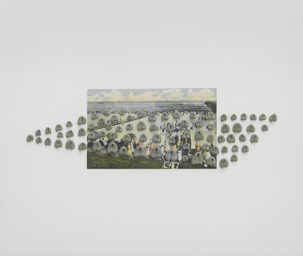
Hannah Wilke: Atlantic City Boardwalk (image from here)
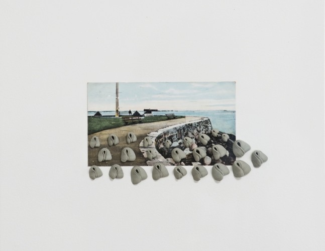
Hannah Wilke: Sea Wall (image from here)
I just love the way they look - but I have no idea why I am so smitten. Having looked at her website, there are only one or two other similar assemblages which I'm drawn to in her work.
Lili Dujourie: Passion de l'ete pour l'hiver still from video (image from here)
In a gallery between The Self in Private and The Self in Public there were video screens. One drew me close, and made me think. Lili Dujourie's video did not have headphones, and I was quietly mesmerised by the simple presentation of a woman at a window, moving gradually round, with a dog lying nearby.
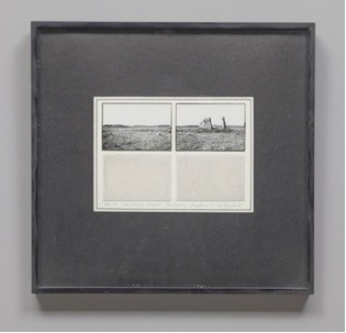
Michelle Stuart: Earth, Standing Stone, Wiltshire, Avebury, England (image from here)
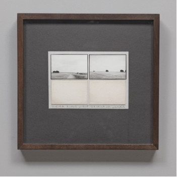
Michelle Stuart: Ridgeway near Overton Hill, Avebury, England (image from here)
In the same room there are several neat intriguing works by Michelle Stuart which I thought should have been with the Landscape works. The pieces on view are beautiful encapsulations of labelled samplings, evidence from magical prehistoric areas of England. The earth from the area is presented below photographs, rather like sheets from a Victorian collection. I'm not sure if the illustrations above are ones in the exhibition, but these are similar. They very much reminded me of the work that Debbie Lyddon has being doing with pigments from the Norfolk coast.
Gwen John: Self portrait (image from here)
The Self in Public included many portraits, and my head already being full of too much thinking I was drawn only to an old favourite: Gwen John's Self portrait. This makes a great top and tail to the exhibition, as I love Laura Knight's woman by the sea which is the first room of the show. Both images are taken from this blog post of the exhibition. Here is a review of the exhibition when it was at the first venue of Tate St. Ives.
Dame Laura Knight: The dark pool (image from here)
This travelling show is at the Pallant House Gallery in Chichester at present. I had been curious to see what the show would include, and why, and was impressed with the ground that is covered - both of the writing, and of the art gathered for the exhibition.
The paintings, sculpture, fabric designs, photographs, videos etc. do not only come from contemporaries of Woolf, but also from all the way up to contemporary artists. The categories covered are Landscape and Place, Still Life, Home and 'A room of one's own', The Self in Public, and The Self in Private. It was all most thought-provoking.
Wilhelmina Barnes-Graham: Blue Stone El Golfo (image from here)
The works which struck me most in the first section: Landscape and Place were paintings by Wilhelmina Barnes-Graham, of whose work I am already a great fan. These three sang across the years with to me as much impact - if not more - as anything contemporary.
Wilhelmina Barnes-Graham: Cliff (image from here)
In the Still Life, the home and 'a room of one's own' galleries I was delighted to find fabric designed by Enid Marx, Vanessa Bell, and Marion Dorn
Vanessa Bell: Pamela fabric design (image from here)
Vanessa Bell: Maude fabric design (image from here)
Barbara Kasten: Untitled 13 (image from here)
I was intrigued by photographs by Barbara Kasten. She made models - sculptures in fact - and photographed them. I have seen several sculptures made of perspex in the 20th century but which now are frankly quite 'manky' looking. It was great therefore to see one as the artist who had just made it wanted it to look - even if that is not in three dimensions.
Barbara Kasten: Untitled 11 (image from here)
Of course Kasten made these in the 1970s, so I persuade myself (remembering that decade well) that perhaps the models might still look reasonable.
The Self in Private included much feminist art which did not attract me, and with an exhibition encompassing so much diverse work I tend to focus on what attracts, delights, or intrigues me. Certainly the two works by Hannah Wilke in this gallery seduced me. Each is a vintage postcard with added kneaded eraser sculptures.

Hannah Wilke: Atlantic City Boardwalk (image from here)

Hannah Wilke: Sea Wall (image from here)
I just love the way they look - but I have no idea why I am so smitten. Having looked at her website, there are only one or two other similar assemblages which I'm drawn to in her work.
Lili Dujourie: Passion de l'ete pour l'hiver still from video (image from here)
In a gallery between The Self in Private and The Self in Public there were video screens. One drew me close, and made me think. Lili Dujourie's video did not have headphones, and I was quietly mesmerised by the simple presentation of a woman at a window, moving gradually round, with a dog lying nearby.

Michelle Stuart: Earth, Standing Stone, Wiltshire, Avebury, England (image from here)

Michelle Stuart: Ridgeway near Overton Hill, Avebury, England (image from here)
In the same room there are several neat intriguing works by Michelle Stuart which I thought should have been with the Landscape works. The pieces on view are beautiful encapsulations of labelled samplings, evidence from magical prehistoric areas of England. The earth from the area is presented below photographs, rather like sheets from a Victorian collection. I'm not sure if the illustrations above are ones in the exhibition, but these are similar. They very much reminded me of the work that Debbie Lyddon has being doing with pigments from the Norfolk coast.
Gwen John: Self portrait (image from here)
The Self in Public included many portraits, and my head already being full of too much thinking I was drawn only to an old favourite: Gwen John's Self portrait. This makes a great top and tail to the exhibition, as I love Laura Knight's woman by the sea which is the first room of the show. Both images are taken from this blog post of the exhibition. Here is a review of the exhibition when it was at the first venue of Tate St. Ives.
Dame Laura Knight: The dark pool (image from here)
Subscribe to:
Posts (Atom)


