This summer I was determined to take my stitching outdoors more. This is such a pleasure when it works well, but can be an incredible palaver to organise. I had tracked down a product made by Margaret Cooter: perhaps I could commission a cross-body version of her Travel Lines Tote which would be just right for all the gubbins I wanted to take down the garden with me.
I commissioned one from Margaret based on the Circle Line, which is the underground line I used by far the most in my London years. How I looked forward to receiving my bag, and to spending more time in the garden. However, it is surprising how much a life can change over just part of a season.
It is interesting that that need for the commissioned tote bag remained. Now, the need for a neat cross-body bag is as a soft but secure container for my syringe driver, the essential delivery mechanism for all my palliative care needs.
Co-incidentally also, Margaret asked that payment be made to Medecins Sans Frontiers. It is great that something hand made, hand stitched, soft, companionable, is making lovely links. Thank you Margaret.
Julie Speed: Eyes to see (image from here)
After much hospital to and fro, latterly to have a needle biopsy (don't ask!) which should bring a definitive answer this week or next, I am still stuck with my ascites, discomfort, exhaustion, not being able to eat much, and with intermittent sharp pain, and of course worry. The thinking so far is that I have bowel cancer spread around to other organs, inoperable, and am to start chemotherapy as soon as they have pinned down exactly what's what so that they can put together the appropriate cocktail of drugs.
Usually someone who immediately starts thinking about possible solutions to any problem, I must admit myself to be somewhat stumped right now. But although I cannot concentrate on art books, or serious study, I can at least read novels.
I decided to try Joanne Harris' quartet of Chocolat titles. I had never read anything of hers, but had heard her speak on the radio. Unfortunately I was disappointed. I especially disliked The Lolipop Shoes which I found to be a horror story. But then I also am not especially enamoured of chocolate. They were a bit too sweet and sticky for me.
That's also the downside of binge reading. I stuck with the four titles, one after the other, when all the little things which irritate are exaggerated. On the other hand, I have similarly been binge reading Ngaio Marsh, and have been thoroughly delighted.
Although the detective protagonist Chief Inspector Alleyn remains constant, his murder investigations are set in different places, even in different countries, or even on board ship. Marsh is excellent at character, dialogue, and description as well as brilliant with story. I dread running out of her novels because they provide me with such excellent distraction.
I have run out of Josephine Tey mysteries, but Nicola Upson has written a series of novels with Tey as the protagonist, and a new one is due out later this year.
Recently I have been visiting hospital to undergo tests. I have dreaded going back to the hospital after I spent so much time there some years ago when my mother was ill. Now the horrid experience of being poked and prodded and not yet definitively diagnosed is mine - and in such thoroughly depressing surroundings.
Why are some hospitals so disgracefully devoid of anything visually comforting or uplifting? It is bad enough for those of us who are temporarily unwell, but how awful for those who are over worked and under paid spending all their working days in these surroundings. Because of financial shortages the places are not only far from uplifting, but generally give a strong impression of not being cared for. Only the care of the staff towards the patients is generous.
At present I am unable to do much other than read distracting novels (I read Denise Mina's Conviction, and am working my way through Ngaio Marsh's Inspector Alleyn novels.) So today I started distracting myself with thoughts about what kind of art I would like to see on hospital walls.
Work which is positive and pleasant in appearance would of course be desirable, but I think that I personally would want something that also engages curiosity and thought, just as I prefer to read novels which are well written.
Of course because everyone has different aesthetic taste, I can see why some hospitals go for still life paintings. But the first example I thought of was something by the Mark Boyle family.
(image from here)
When I have encountered his work I was fascinated by the large reproductions of random parts of the world. Such a size I think would tend to take minds off personal problems for a short time at least, rather than sitting in increasing dread anticipation. But maybe this would be too close to the actual surroundings! That especially so if the story behind the artwork is not explained.
I do think that size is important. The image must demand attention to distract.
(image from here)
Jeff Wall's photograph inspired by Hokusai does that, and even if you don't know the original there is so much to attract, intrigue, and amuse. I also think that keeping the mind alert is a good idea, because as I have found, it is so easy simply to deal with the situation simply by shutting oneself down.
Perhaps large reproductions of Hokusai prints, or something similarly human, busy, and with a touch of humour.
What do you think?
Edvard Munch: The Kiss IV (image from here)
I'm lucky that this year there just so happen to be three exhibitions on at the same time covering artists of interest to me. The three artists are from that fascinating melting-pot of an era: belle-epoque into modernism the end of the 19th century into the 20th, and all three artists were influenced by having been in Paris, though not French themselves. Munch, Schjerfbeck, and Vallotton are all individual artists, on the edge of movements, but so connected with what was going on in Paris that they shine a light on it all as well as being interesting in themselves.
Edvard Munch: Theatre Programme for Ibsen's play Jean Gabriel Borkman (image from here)
Of course aware of The Scream and a few other works, I did not otherwise know much about Edvard Munch. Edvard Munch, Love and Angst is the catalogue of the British Museum exhibition, and a fascinating read. I was interested to read about his life and about the psychology behind the angst-ridden aspects of his work, and of prevailing attitudes to psychology in wider society at the time. It is also interesting to read of his illustrative work, especially with regard to theatre programmes, and how popular fellow Norwegian playwright Ibsen was in Paris at the time.
His wood prints are so interesting, their immediacy exciting my curiosity.
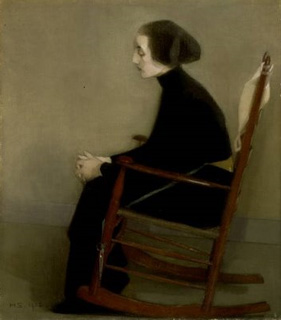
Helene Schjerfbeck: Self portrait 1912 (image from here - with review)
Helene Schjerfbeck's still figures appeal greatly to me, and I love her self portraits. She was Finnish, but not only spent time in Paris but also in St Ives. I regret that I had not known her work before now, but have much enjoyed reading the Royal Academy exhibition catalogue, and finding out so much about her and her works now.
Helene Schjerfbeck: The Seamstress (image from here - with blog post)
Felix Vallotton: The Lie (image from here - and review)
Now I am deep into the catalogue of the third exhibition, of the work of Felix Vallotton. As a great fan of Vuillard's work I knew of Vallotton's paintings and some of his prints. I love the enigmatic quality in his paintings, and their dramatic composition. His use of colour is interesting - indeed, the work of all three artists bring lots of questions about use of colour to mind.
Felix Vallotton: Money (image from here - and review)
I enjoy Vallotton's use of black as a colour in his prints too.
It is such a joy to have three perspectives on an interesting period of art.
Natalia Goncharova: Three Young Women (image from here)
These days art exhibition catalogues seem to dominate my serious reading. At present it's Natalia Goncharova - an exhibition on at Tate Modern.
I first encountered this artist in a postcard of the above image. When I started working in London in the early 1970s I was a frequent visitor to museums and galleries where there was a wide range of postcards of the collections available. Not having the means to purchase magazines and books in those days, I did binge on postcards which I would stick up on my walls at work. The above was one of those, but I did not know anything about the artist.
Natalia Goncharova: Hay cutting (image from here)
Now I am discovering all about her through the splendid catalogue. So many of her paintings, unlike the one at the top, remind me of my early childhood summers in northern Greece and the views in the '50s of farming activity in the landscapes we passed with the train across Europe.
Natalia Goncharova: Linen (image from here)
The religious paintings chime with the icons which surrounded me, and the lovely painting immediately above reminds me of the laundry near our flat where to my wide-eyed childish fascination they used irons just like the one pictured. When I was about four, when I was the only child in the whole extended family, there were many aunts alive, and we would go for glorious picnics when the days seemed to stretch forever. I find that Goncharova's paintings chime with my memories of those times. This is especially true of the image below which is from Eirene's blog A Place Called Space and her post on the Natalia Goncharova exhibition at the Tate.
Natalia Goncharova: Apelsinia (image from here)
This catalogue is therefore not only full of information but also a lovely reminder of a most enjoyable time in my life.
I was excited when I found out that the courtyard sculpture for this year's RA Summer Exhibition was to be by Thomas Houseago. His figurative work has struck me as so fresh, of our condition today, as well as giving a nod to the past.
It is always invigorating to find artists who take existing ideas and subjects and through rendering those ideas in their own style add value, give another perspective. Thus the ideas grow and our thinking is expanded.
The figures are monumental, and yet vulnerable.
They are accumulations, and so much more than the sum of their parts.
They still excite and inspire me.
Overall this year's Summer Exhibition was successful for me. I saw the work of three powerful artists: Turrell, Rego, and Houseago, which would have been reward enough itself. But I also saw many works which I found attractive and gave me pleasure.
James Turrell: Mors - Somnus (07) Medium Diamond Glass (image from here)
One work in the RA Summer Exhibition that was worth the visit alone for me was James Turrell's light piece in a quiet cool dim room. The diamond square of light changes colour ever so gradually, and not an even flat colour. Subtle tones are spread across the whole square, radiating from its centre. The square is set in a white wall, not black as shown above. Except that it does not look white: as the colour changes in the square its subtleties are signalled first in what you apparently see of the opposing colours in the surrounding wall. Those of you who typed on the original word processors will remember that the bilious green text would conjure up red letters when looking away or shutting eyes.
This piece of Turrell's - as so many of his - is extraordinary colour work. This is where Mondrian was leading.
This work was compulsive viewing, entrancing, thought-provoking, and so joyous. This is an artist who makes me look at the world again and again, and think about what I am seeing.
Banksy: KEEP OU (image from here)
After so many decades of looking at images, pictures, paintings, what is it that catches my eye? Often it is familiarity - or perhaps lack of familiarity. Certainly one aspect which holds my eye is composition. It does not have to be drama, but there needs to be a reward of some kind. The image must make me think - and think beyond the question of how it was made. For me content is queen and must definitely rule over technique. This is easier for me with painting because I don't paint. Content is still supreme although more difficult with prints as I am familiar with the techniques, and that can intrigue even if the image is not satisfactory to me. This is all personal preference needless to say.
Glen Onwin: Shades of Darkness - Light and Colour (Goethe's Theories) Blue, Red, Yellow. Earths Major Cycles (image and title from here)
Individual works are easily overlooked at the RA Summer Exhibition, and one reason why Gallery IV was my favourite is that the hang was relatively sparse. Works had room to breathe and be themselves. Glen Onwin's framed pigments (above) were arresting, being the physical embodiment of colour; pigment which was gradually accumulating at the base of each frame.
David Remfry: Chandelirium (image from here)
I very much enjoy being surprised to find that a work which attracts my eye is by an artist who is familiar, but in this case unfamiliar. This was my delight in seeing David Remfry's painting above.
Stephen Chambers: Portrait of Agatha Roman (image from here)
Portraits can be so interesting, whether the subject is known or not. Stephen Chambers' Portrait of Agatha Roman is perhaps from his Court of Redonda series, and she intrigued me additionally because her hands seemed to have a separate life of their own.
Sonia Lawson: Homage to Courbet (image from here)
Another portrait which intrigued me was Sonia Lawson's Homage to Courbet, which is so different from Courbet's own self portrait - as well as being different from the cabinet-of-curiosities style of Lawson's with which I have been familiar of recent years.
Tony Bevan: Self Portrait (image from here)
A self portrait which really caught my eye near the end of the exhibition struck a philosophical note - 'I think, therefore I am'. Tony Bevan has produced several self portraits, and this is not quite a brain, but it caught my imagination.
I liked many other paintings, but these above held my attention for more than the passing pleasurable moment.
Paula Rego: Death of the Virgin (image from here)
In an exhibition like the Royal Academy Summer Exhibition it is inevitable to encounter works by familiar artists, either by Academicians themselves, or Honorary Academicians, or by familiar invited artists. Often the reaction is - oh, there's another one by so-and-so, and the feeling is of a so-what-ish kind. Of course this doesn't mean that the work is not good; simply that a previous example struck a more positive response. Indeed I had that reaction to the Anselm Kiefer painting in this year's exhibition.
Paula Rego: Agony in the Garden (image from here)
Four paintings by Paula Rego, however, did affect me greatly, despite my having seen so many of her similar works before.
Paula Rego: Deposition (image from here)
What hits me first is the substance. They not only are full of dimension, the paintings carry so much within them. The subtle use of materials gives on the one hand a quality of fabric in the dresses that I can feel: a stiffness of stuff, as if those dresses are the armour, support for the tender flesh within them. And on the other, the delicate but firm pencil lines outlining such as the ears, the curls of loose hair signal that tenderness.
Paula Rego: The Visitation (image from here)
There is so much here that I looked and looked for some considerable time, and felt so many reactions from exhilaration through joy to disquiet. For me these four are in a class of their own, so I shall cover the other paintings which drew my attention in a separate post.
Thomas Houseago: Untitled (Red Man) (image from here)
This year's RA Summer Exhibition had yet again presented something different. For me one outstanding positive was the number of sculptures which delighted, starting with Thomas Houseago's work in the courtyard.
The main lift was not working today, and so I was escorted through the labyrinthine corridors backstage to a staff lift to get to the main exhibition.
Marcus Harvey: Napoleon Invictus (image from here)
The first large room, Gallery III, is mostly full of paintings, but on a half-wall of their own are Marcus Harvey's pieces, two busts Napoleon Invictus and Full Nelson either side of his painting Victory.
Marcus Harvey: Full Nelson (image from here)
This trio benefited greatly from their virtual isolation. I found that the rest of the room looked good as a whole, but that nothing else leapt out for my attention.
Thomas Schutte: Mann Ohne Gesicht (image from here)
The next sculpture which captured my attention was by Thomas Schutte, entitled Man without face. The stance of the man in shallow water was enough to draw me to look closer, then I saw that his face had been cut off, and that this was in his right hand. I found this to be a quiet, powerful statement.
Room IV, hung this year by Barbara Rae, was my favourite room as a whole. I enjoyed more individual pieces of work in here as well as the look of the whole.
David Mach Easy tiger (image from here)
Two sculptures caught my attention - one of which certainly could not be ignored. David Mach's Tiger covered in Tunnock's teacakes foil was in this gallery when I saw it. Fun, certainly, and of course prompted the thought of how many of the teacakes he'd eaten himself.
Nicola Hicks: Bear from dump circus (image from here)
The second sculpture appealed to me more, and had a poignancy to it as well as aesthetic attraction: Nicola Hicks' Bear from dump circus.
Tim Shaw: Parliament (the voices in your head) (image from here)
Gallery V came a very close second favourite; it was hung again by Barbara Rae, this time with Hughie O'Donohue, and contained a great many interesting prints. The sculpture which I loved, however was by Tim Shaw: Parliament (The voices in your head). The whole as presented is more complex than shown in the photograph. There are additional pieces of detritus: cardboard boxes, torn paper, and there is an audio tape running. I was intrigued and delighted.
Janet Mullarney: Dancer (image from here)
The two other sculptures which particularly appealed to me were both figurative: one by an artist I have not encountered before, and one by an old favourite. I have not consciously met Janet Mullarney's work previously, but a quick look at her website and her galleries here and here make me want to find out more.
Mimmo Paladino: Untitled (image from here)
Mimmo Paladino, on the other hand is someone whose work I have enjoyed looking at over many years.
There were other sculptures which I enjoyed, but these were the stand-out ones for me. I shall write further posts on prints and paintings.