
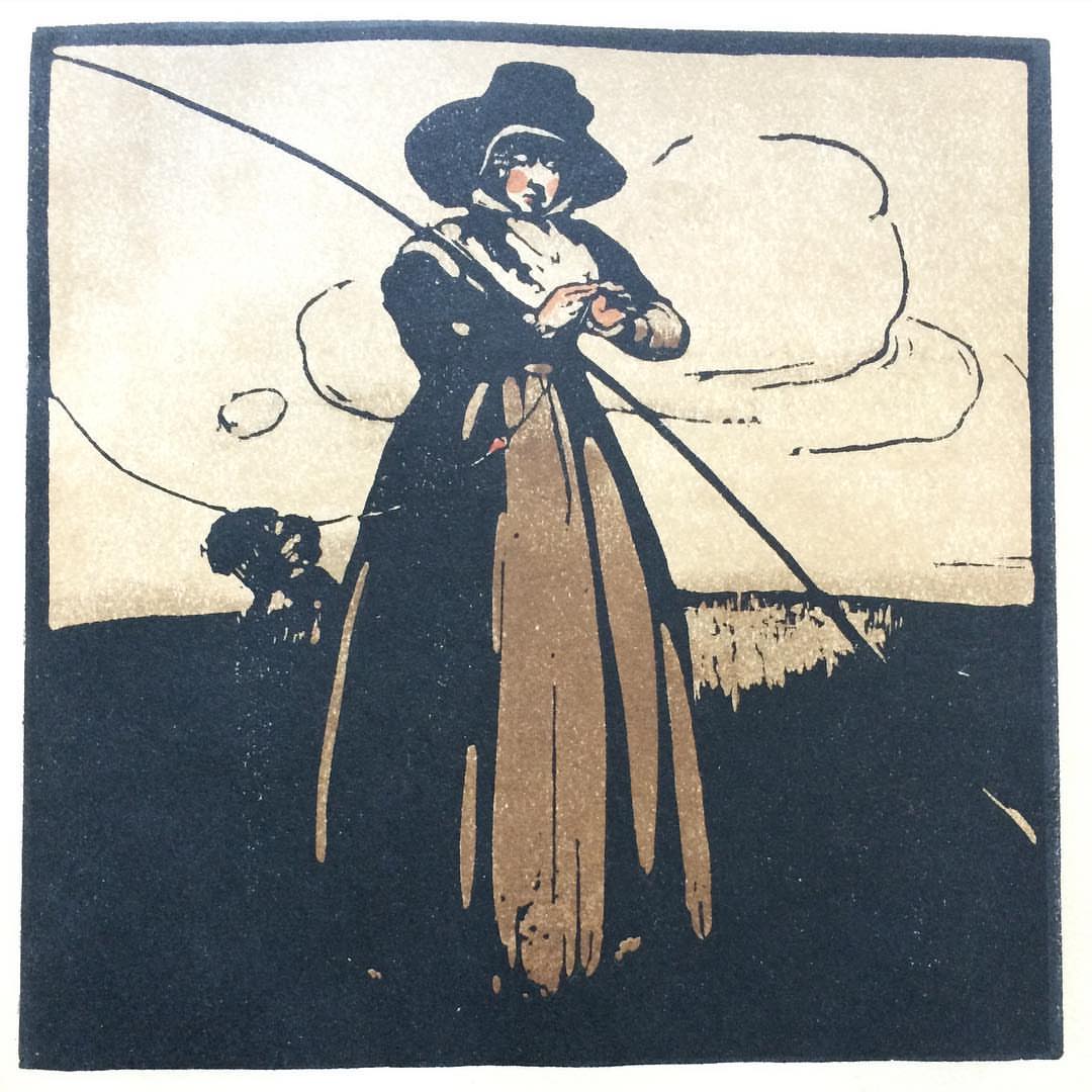

Yesterday I posted an image I've been working on, with an idea at the back of my mind influenced by the woodcuts of William Nicholson. I first saw his prints on the wall of the grand staircase of the Mayfair offices of the publishing house William Heinemann in the 1970s, and they have been firm favourites of mine ever since.

I admire the way he conveys so much with such simple, seemingly static lines and blocks of limited colour. And although one can see the influence of both German and Japanese woodblock traditions, Nicholson's work is decidedly British in feel. I think that the gentle humour has something to do with that, but also unfortunately the categorisation of various 'types' which are certainly not now politically correct emphatically tell of the time and the attitudes when he was working.


I also very much am attracted by the use of typography as part of the composition. There were often such benefits from it having been cheaper to have the artist encapsulate the caption within the illustration - if of course skilled like Nicholson.

I so like the heavy black, and especially the black border which makes his prints immediately distinctive. The figures burst out of their confinement, alive despite their flatness.
I find these very appealing too - maybe it’s the contrast between the heavy black and the limited colour palette. I’m fascinated by how, using such a palette, he managed to get such depth in his prints - something for me to think about maybe...?
ReplyDeleteMargaret, I'm glad that you too like Nicholson's prints. He is skilled with providing a deep background, isn't he - even if it is a simple line indicating a cloud, or a brief glimpse of a horizon.
Delete