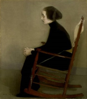
Friday, June 01, 2012

Basic nitty gritty

I found no straightforward set of rules for printing in a loose painterly way with carborundum, and Holly our teacher had no great experience of it, so I decided to roll up my sleeves even further and do a few trials.  This was to give myself somewhere to start, at least rather than just mucking about almost blindfold.
We kept seeing references to heavy acrylic gel medium as the binder, and also PVA, but nothing definitive, or really in depth.  So, I took two grades of carborundum: a medium and a coarse, PVA, some Liquitex Heavy Body * which I had bought when we were working on collagraphs, a spoon, and some tubs, and started stirring.  I mixed up four pots' worth as my starting point.  Then I prepared two perspex plates.  On one I brushed a large numeral with each of the mixtures from the correspondingly numbered tub, with a few stabbed brush marks underneath.  On the other plate I used a small sponge roller (the 'throwaway' type you can pick up in art/craft shops) to make a 'solid' area out of which I cleaned a numeral, again corresponding with the mix.
So far, so interesting, even at this stage.
Then I inked them up with black etching ink, and printed them on two pieces of dampened BKF Rives paper, one after the other so that I had the immediate ghost.
First mix is one part medium carborundum to two parts PVA glue.  I found it horrible trying to carve out the numeral 1 out of this mix.  It was not happy giving any precise marks.
Second mix is one part coarse carborundum to two parts PVA glue.  This mixture was even more difficult to control than 1, and as you can see there is no numeral because a whole 'flake' lifted off when I tried any removal.  I learned also that the mixtures will devour ink, but be almost impossible to wipe back.  Indeed with this mix the wiping back removed the mix also, leaving the pristine perspex.  Holly suggested that as I liked the possible effects of this mix that I should consider using it on card to present a firmer grip, and then seal that as for a normal collagraph.
The third mix behaves much more like acrylic paint.  It consists of one part medium carborundum, one part PVA, and one part Liquitex Heavy Body.  The numeral 3 was easy to carve out with a drypoint tool, and this encouraged me to start considering ways of using this as viable - especially as it has not dried out in my little tub (with lid - originally containing mackerel pate!).

Mix number four consists of one part course carborundum to one part OVA, and one part Liquitex Heavy Body.  It also behaves like acrylic paint, but with fewer and larger lumps in unpredictable distribution (unless, I suppose you become meticulous about where you put the agglomerations of large carborundum bits).  I like the way that the brush marks are more prominent.  I did not make a clean job of carving out the numeral, but that's my fault.  On the other hand, the dried rolled mix is not as easy to carve into as mix 3 because of the uneven distribution of larger elements.
As you can see, I cut these up and stuck them into my printmaking notebook.  The next experiment was to paint a layer of mix three onto a perspex sheet, then carve out of it with an etching tool, and see what happens to that as a plate.  I'm sloshing about with nascent printing skills, but it's bringing more interesting possibilities for picture making into focus.

* The reason why I went for Liquitex when we were making collagraphs was that when I lived in the USA and painted with acrylics Liquitex was the make available at my nearest art store.  I had noticed then that they did mixes with interesting elements like sand, but had never had reason to use it then.  This stayed in my mind, and popped up when I needed something to make a collagraphic plate.  The Heavy Body I discovered on the website when I was looking for the sand stuff. 

Monday, May 21, 2012

Mellow yellow

The oil seed rape made an overwhelmingly yellow landscape as I drove over the Lambourn Downs the other day.  The snaps were taken from the car.

Wednesday, May 16, 2012

Auction and experiment

I've sent off my square for the SAQA Benefit Auction - Just dancin'.  It is part of a design which derived from the envelope in which my Surface Design magazine used to come.  It used to be covered - yes, covered in bright stamps from Hong Kong, direct from the printer.  The design shows how I felt when such envelopes arrived.
Meanwhile I am juggling blocks of time and mind between printmaking and stitching.  The areas are further broadened by my initial small researches into the world of tapestry weaving.  I have just read a beautiful book published by the excellent Black Dog (I have recently read The mechanical hand, a printmaking title)- Tapestry: a woven narrative. (I was delighted to find a splendid offer for the book in the current issue of Embroidery magazine.) This is another area of textiles I've been interested in for some years, and now I have the time to explore.  But I shall be spending more time stitching during the day as the tennis season is in full flow - no need to feel guilty while watching tv in daytime!
In printmaking I have been devoting this half term at least to exploring more painterly ways of creating marks.  The above image is another early example with blocks of Liquitex sand medium on one perspex sheet, and a drypoint line on another plate with chine colle using printed tissue paper from Paperchase.
I have also been mixing carborundum grains with PVA and with Liquitex heavy body in four alternative mixes, and have painted each mix onto perspex.  I shall print those perspex plates tomorrow, and will let you see the results next week.  Nothing is instant in printmaking!

Wednesday, May 09, 2012

More printmaking experiments

I have no idea if anything will come of what I'm doing, but I am certainly enjoying the journey.  Here is an image of one of the polyester litho prints I was talking about in the last post.
What is occupying me at present is the technique of carborundum printing.  I have been trying to find out as much as possible on the Internet about this technique.  I love the effect, and have so often been attracted to images which are described as carborundum prints, or using carborundum.
Before using carborundum itself, I have started by using material I already have: a Liquitex medium mixed with sand painted onto acrylic to make a plate.  Well, one plate, and also another drypoint plate to combine line with the texture.  Below is an example of the first quick plate,

and a close-up to show some of the kind of texture I'm beginning to explore.
What is interesting, and perhaps worrying, is that each time I clean the plate, some of the medium comes off.  This makes the subsequent print more textural and less dense, but eventually the plate will be ruined.  All part of the experiments, of course.
I was initially inspired by the wondrous effects Howard Hodgkin achieves in his prints.  (Click on What are Prints in this link to read a bit more.)  Another artist whose work I admire in this field is Henrietta Corbett.

Tuesday, May 01, 2012

Grids, ... well, loosely

For some time now the idea of working with grids has been floating around in my mind.  One could say that as I work with the quilt form, that would in some senses be inevitable, I suppose.  I very much respond to the juxtaposition of the formal with the informal - such as seeing a lush planting of a loose, 'unruly' plant spilling out of a neat border of box hedging.
Dry stone walls appeal to me in the same sort of way.  I like the way that they fall down too.
This one was outside the boathouse where we were staying on Skye, and had once gone right down to the loch at the left, but was now falling down gradually. On our way cross country as we came homewards we saw some beautiful new drystone walls which had neat sticking out lines - two: one towards the top, and one towards the bottom.  (Please forgive the lack of technical terms.  I am totally ignorant about the subject, and have not yet been able to track down anything similar on the Internet.  I did find this website, however, which is full of interesting information.)
As luck turned out there is an exhibition of Sean Scully paintings on at mima which I wanted to cross the country to see.  (At this point we were at a narrow part of England, and could cross with no great trouble, and still be -sort of- on the way home. And on our way across we saw the walls mentioned above.)
Although Sean Scully is also interested in dry stone walls, his work, and these paintings on display are of a tightly disciplined griddy nature.  These are not anything I would strive to achieve, but I love them, and what really makes them beautiful for me is the use of colour.
I found it to be an excellent exhibition, which not only attracted me, but reinforced my thinking about the countryside I had been looking at for the past week or so.  Scully has said that “People tend to think of abstraction and abstract. But nothing is abstract: it’s a self-portrait. A portrait of one’s condition” in describing his work. This has loosened up my thinking about how to relax about using elements of what I see and what I feel without having to reproduce the source of those elements.  This is probably obvious, but I have found it difficult to realise within my creative practice.
Printmaking has been very helpful to me, even in my clumsy elementary forays into the craft.   Another great input during this holiday has been my finding a great book (yes, I bought yet another book!): Wildlife in printmaking.  The quality of the printmakers is wondrous, the reproductions look superb, and the printmakers very generously describe their techniques.
So this holiday has been a supremely stimulating time, and I am happy to say that my first day back in the print studio today was a gloriously productive one.  I am taking further the loose gridmaking approach which I used with the monotypes I made in the final session of last term - using a roller laying of of ink, vertically and horizontally on a polyester litho plate which has a figurative, and non-grid image.
I can't show you how the prints look as they are now drying on the rack.  My purpose is not to keep them as prints, but to use them as elements in the design of a large piece of textile work.

Monday, April 30, 2012

Just some details

Back home now there is the settling in, washing, resumption of printmaking classes, and the sorting of thoughts.  Here are some of the details I took, for reference, as colour swatches, because an idea stirred, ....

Friday, April 27, 2012

Wildly windy

The wind increased tremendously overnight, and our next outing presented quite a challenge not only standing up and walking, but even getting out of the car.  Nonetheless, the beauty of the weather here is that, wait a moment and things will change. 
Our next trip was to drive over to Elgol to look at the Cuillin mountains.  (Note the sunshine and calm waters in the photographs on the Elgol link!)  One of the many fascinating things about the landscape around Skye is that it changes so much from one peninsula to another, and even from one side of a peninsula to another.  The colours also alter and modulate in the changing light, even as you drive past.
Also, talking of driving past: several roads involve single carriageway with passing places, which on a curving route with blind hillocks can be a mildly stressful experience.
 
Yesterday our first stop was at the McKinnon family graveyard which is in a magnificent setting with many elaborate graves.  This link tells more about the family, and 8. shows a map of the graveyard.
We have been particularly impressed not only with the variety of rock on the island, but also with the range of lichens to be found.  This graveyard had quite a few of the latter.  I was most taken with the cream and white ones here, and with the strange 'millefeuille' rocks around (draped with wisps of wool).
We were by now so wind-battered and exhausted just from standing up that we were delighted to see at the parking space that the Blue Shed Cafe was only 3.5 miles up the road.
Relief came in the shape of coffee and lemon polenta cake (scummilicious!)  And I was entranced by the friendly pig out back - which makes a change from the ubiquitous sheep and cattle.
Then, fortified, we were back on the road over mountain and down to loch until we reached the coast.  Overcast and wildly windy, there was still a great deal to see and to wonder at. (And trying to prevent the car door from crashing into a neighbouring parked car or from alternatively breaking a leg as we got out was a challenge all of its own!)
From up on the mountain we could see the 'pleasure' boats.  (Remember those lovely calm sunny scenes on the Elgol link?)  From up here it was almost impossible to see the mountains opposite because of the low cloud, but once we had plunged down to the harbour of course the visibility had changed a little.
Of course on our way back the sun came out, but even the sheep and lambs were choosing to forage amongst the birches rather than face the wind
which remained wild and forcefully blustery - until this morning, when once more we had calm sunshine with huge fluffy clouds.  But, as I type this and look out of the window at the loch the specks of white are increasing.  Never a dull moment, weatherwise.  A week is too short a time really.  Tomorrow morning we set off on the beginning of the long drive back home.