The most dramatic print, one which stood out with no difficulty in the midst of a packed wall was a wondrous piece by Richard Long, resembling his wall and floor works using river muds this was made using carborundum and acrylic. Stunning work.
Honky Tonk Women
Rebecca Salter's minimalist prints intrigue and attract me. I have a great admiration for the discipline and find them inspiring although the images are nothing like what I want to achieve. I did not see all of her pieces in the exhibition, but the two which I like especially are Grisaille Series I and Grisaille Series II, both Japanese woodblock.
One image which attracted my attention was not my usual fare, and so I was keen to find who had made it - and was surprised and delighted to find that it's an etching by Kiki Smith, someone with an interesting and unpredictable range of works.
In a Bower hand coloured etching and acquatint
Printmakers whose work I often like are Katherine Jones and Andrzej Jackowski, and these two prints were worth seeking out.
Katherine Jones: Clear surface Intaglio and woodblock
Andrzej Jackowski: At the lining - flowers Lithograph and chine colle
Two tiny delights I deliberately looked for. I had seen on television that two artists together produce intaglio prints of trees on a 'paper' made of the specific tree's leaves. Emma Buckmaster and Janet French made Ilex Aquifolium (below) etching on holly leaves
and Fagus II on beech leaves
I was pleased to find a Paula Rego drawing - a powerful image, as ever:
Death of the blind sister acrylic and conte
There were other drawings which caught my eye too. I think my favourite was by Kate Dunn
Untitled (Shenzhen Women) conte drawing
There were others that I liked, of course, but I think I'll stop here with just one more post - on textile pieces.
I don't really have great expectations of sculpture when it comes to the Summer Exhibition, with a few memorable exceptions. This year's courtyard piece is quite something - public art at its best: spectacular, beautiful, entertaining, and thought-provoking. Ron Arad's Spyre is ingenious - the camera eye at the pinnacle sees, and what it sees is shown on a large screen. (Please forgive my inadequate snaps.)
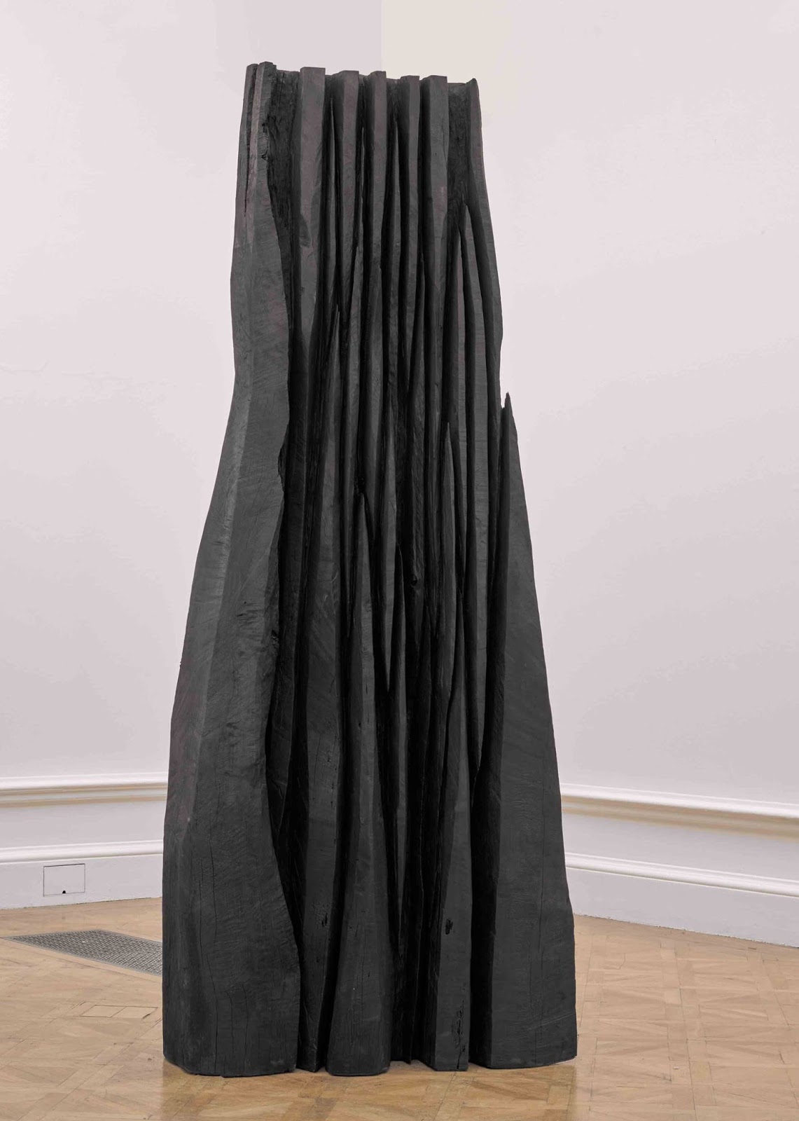
Inside the exhibition I found that as in most years the majority of sculpture tends to become an obstacle while wandering backwards craning to see the works high on the walls. My introduction to the work of the marvellous sculptor David Nash many years ago was by badly grazing my calf on a piece of his. This year his piece Big Black was awarded the Charles Wollaston Prize as being the most distinguished work in the exhibition.
It is a wondrous piece, but hardly looks its best in a small-ish crowded room. The photo here shows it without the packed walls and the many visitors. Nevertheless it did provide a lovely backdrop for a man taking a photo of his wife. Hmmmm!
Similarly, Peter Randall-Page's Inside Out provided another obstacle, not only getting in the way of seeing the works on the walls (especially given there are three parts), but also not being in a position to receive the admiration they deserve.
I am a great admirer of his work, however, and was delighted to see beautiful examples on the walls:
Sap River V ink drawing
Tarantella I screenprint
Tarantella II screenprint
Source Seed IV ink drawing
You see that once more I was drawn to the graphics and simply stepped round the big pieces and the plinths. Shame on me, but only on many visits could I realistically look at everything. This year I enjoyed the prints and works on paper most, and I shall continue my posts with them.
This year there were far fewer paintings which made an impression on me, but those that did were distinctive. The first that wowed me was by Hughie O'Donohue: The Girl from Stellata. It is a big piece and was one of the few which held its own in the chaos on the walls (although it makes a less than successful image on a blog!).
As ever Sonia Lawson's work attracted, and in particular her River Revisited.
The muted colours, having to look hard to see the different animals and elements, the repeats, the patterns, the calm, the subtlety all made this a wondrous piece for me. I was able to get up close and lose myself in it.
Ian McKeever's two gouaches on paper Portrait of a Woman 4 and 5 are lovely, but they lost so much of their effect amongst such disparate competition. And although Anselm Kiefer's Bose Blumen attracted my attention and my recognition from the other side of the gallery, it too felt distracted by the surroundings.
My favourite painting is Mick Moon's Evening Fishing, which like the Lawson I was able to approach at eye level, and thoroughly delight in the subtle colours and delicate drawing on a sea of wood grain.
Although there were other paintings which attracted, these three reproduced here were the ones which gave me joy, and which may also have inspired me.
At the Summer Exhibitions in the past, on the whole the Small Weston Room has been dedicated to tiny paintings all crammed in both horizontally and vertically way up the walls. From time to time, however, a change is made, and this year the room is dedicated to the photographs of Bernd and Hilla Becher.
Water Towers: (Bahnhof)
It is wonderful to see just one group of their photographs of industrial buildings, but to have five groups is just such a bonus. The love, respect, and attention to detail shown in these disciplined photographs, showing disappearing industrial buildings as a kind of sculpture make these works thoroughly captivating. The multiples, the collections satisfy both in the similarities and the diversities shown.
I fell in love with their work when I saw a few of the photographs in the collection at the Pompidou Centre in Paris many years ago, and my admiration has grown steadily since then.
is back to the normal white walls, and back to losing so many of the individual pieces which melt into their neighbours. (Image above from here) My immediate reaction is that overall I am not filled with as much delight as last year. There are, of course individual pieces and groups which did catch my eye, delight, and even inspire.
Bill Jacklin: Rink II carborundum
And the cherry on the cake was the separate display of Bill Jacklin's prints for which I had come prepared by reading the catalogue in advance, and which I very much enjoyed (both catalogue and prints). I went there last so that I could come away positive, and with a coherent image in my mind. Bill Jacklin is a painter and printmaker whose work I have been drawn to for many years now, after first seeing RA postcards of his prints. So often it has been postcards which have alerted me to a particular artist, and it saddens me that I receive so few these days. They are always such a pleasure, much preferred to an email.
Other prints at the Summer Exhibition which pleased start with Paul Furneaux, whose work I first encountered when researching for a Japanese woodcutting workshop three years or so go. I have seen his work at each Summer Exhibition since, and still admire it. This year there are two pieces: one three dimensional
City Trees II Japanese woodcut on tulip wood
and one mounted on a panel
Burnt Orange: Earth Japanese woodcut
I so enjoy the textures, the movement of the colour in each panel, and the placement/composition of the colours. Each is somehow both calming and lively, with little surprises each time I look at them.
Stephen Chambers is another artist printmaker whose work I like. This year two little prints attracted me:
Stupid Stupid: Cow & Brother etching
Stupid Stupid: Horse & Parent etching
As a Royal Academician he has six pieces in the show. I was not so keen on any other than these two.
My admiration of the work of William Kentridge grows steadily, and I very much enjoyed his two pieces - the huge Mantegna (woodcut) is stunning
and not quite so big, but equally arresting Pocket Drawings 187-241 (lithograph on panel and cotton) had me transfixed for some time.
Ian McKeever's work always interests me, but I think that his pieces suffer rather in the mixed bag surroundings of the Summer Exhibition, his quiet luminosity losing out somewhat in the proximity of loud and showy neighbours. I was intrigued by his three photopolymer gravure prints. Of all his work on show they were the ones I was able to appreciate better, and my favourite - though by a very short margin - is EAGDURU 3.
I think that's enough for one post.
who knows what will happen to us in the UK now - a mystery tour. The image above is a design, Plunge, I devised a few years ago when I felt that way, and am perhaps appropriately about to finish the quilting now.
Meanwhile life goes on with a photography session, catching up with a wee pile of quilts.
The Serpentine galleries have an exhibition on in each of the two buildings.
(image from this review)
In the main gallery is Alex Katz: Quick Light. Although familiar with Katz's work I have not seen it other than singly in mixed exhibitions or of course in reproduction. I still don't know what my reaction is. I admire the seductive facility he has, making the effect look easy as Adrian Searle says in his review. But I am also wary of that seduction. I do not warm to the work, but it was great to be able to explore my reaction to the real thing. I remain appreciative of his abilities without being attracted - I find them unmoving with cool chic-ery.
(image from here)
On the other hand the exhibition of Etel Adnan's work in the Magazine building I found very much a personal statement that endeared itself to me. I did not warm to the figurative work of Katz, but loved the abstract pieces of Adnan. I also especially was attracted to her leporellos - wondrous accordion books so beautifully displayed.
(two images above from here)
(image from here)
A philosopher, poet, essayist, and film maker as well as artist, Etel Adnan has led an interesting life. I not only bought the exhibition catalogue but also Paris, when it's naked to give myself more of her perspective, and to elevate myself from my daily routines. It is wonderful to have so many role models of older women artists these days.
Yesterday was packed with pleasure. Within a few minutes' stroll from one another we visited five temporary pavilions in Hyde Park, London, and two art exhibitions. We went to the Serpentine Galleries to see this year's pavilion, designed by Bjarke Ingels.
I like the elegant shapes made by the very simple constituent parts, and I like the way the whole is both solid and see-through, but inside I found that it has the feel of a corridor rather than a place to sit and enjoy coffee - not helped, of course by the fact that all the coffee machines etc. were wrapped in plastic as if for some later forensic examination.
Also, the pavilion is made of fiberglass which resembles metal, in a blue-grey colour, while the floor, stools, and counters are made of wood which to my mind did not blend well.
So, although I liked many aspects, especially the sculptural, and in a rich woman's garden it would make a stunning retreat, this is not my favourite public pavilion. This year being the sixteenth of temporary pavilion commissions, the Serpentine has in addition four temporary summer houses, each by a different architect.
Kunlé Adeyemi’s Summer House is opposite the existing building Queen Caroline's Temple, and is an abstracted mirror image of it. I was intrigued by the shapes it formed, and by the materials - sandstone and something soft and pliable - but I must admit it did not wow me.
Barkow Liebinger's Summer House was my favourite.
It also was based on a previous 18th century summer house designed by William Kent, and which rotated to seek the sun or to show an all round panoramic view. This piece is both sculptural and practical, and a delight to look at and be in. It is made of plywood and timber, and I loved it.
Asif Khan's Summer House was the best designed as a summer house, I thought, in that it shaded from the sun while still giving a view through to the beauties of the parkland and lake beyond. It is lovely, elegant, and was calming to sit in.
One design I could not pair with the function of summer house at all, but I was drawn to it as a piece of graphic sculpture, encompassing both three and two dimensions. This was designed by Yona Friedman.
Here are some reviews of the pavilion and summer houses.
The two art exhibitions I shall leave for the next post.