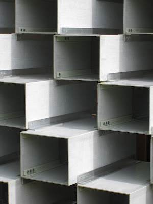
Yesterday was packed with pleasure. Within a few minutes' stroll from one another we visited five temporary pavilions in Hyde Park, London, and two art exhibitions. We went to the Serpentine Galleries to see this year's pavilion, designed by Bjarke Ingels.
I like the elegant shapes made by the very simple constituent parts, and I like the way the whole is both solid and see-through, but inside I found that it has the feel of a corridor rather than a place to sit and enjoy coffee - not helped, of course by the fact that all the coffee machines etc. were wrapped in plastic as if for some later forensic examination.
Also, the pavilion is made of fiberglass which resembles metal, in a blue-grey colour, while the floor, stools, and counters are made of wood which to my mind did not blend well.
So, although I liked many aspects, especially the sculptural, and in a rich woman's garden it would make a stunning retreat, this is not my favourite public pavilion. This year being the sixteenth of temporary pavilion commissions, the Serpentine has in addition four temporary summer houses, each by a different architect.
Kunlé Adeyemi’s Summer House is opposite the existing building Queen Caroline's Temple, and is an abstracted mirror image of it. I was intrigued by the shapes it formed, and by the materials - sandstone and something soft and pliable - but I must admit it did not wow me.
Barkow Liebinger's Summer House was my favourite.
It also was based on a previous 18th century summer house designed by William Kent, and which rotated to seek the sun or to show an all round panoramic view. This piece is both sculptural and practical, and a delight to look at and be in. It is made of plywood and timber, and I loved it.
Asif Khan's Summer House was the best designed as a summer house, I thought, in that it shaded from the sun while still giving a view through to the beauties of the parkland and lake beyond. It is lovely, elegant, and was calming to sit in.
One design I could not pair with the function of summer house at all, but I was drawn to it as a piece of graphic sculpture, encompassing both three and two dimensions. This was designed by Yona Friedman.
Here are some reviews of the pavilion and summer houses.
The two art exhibitions I shall leave for the next post.


Fascinating shapes! As a lover of blond woods and a seeming Nordic feel, my favourite is Liebinger's Summer House. Thanks for all the photos, Olga.
ReplyDeleteGlad you enjoyed them Marja-Leena, our favourites coincide.
ReplyDelete